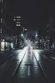
Master the art of color vs. B&W street photography. Learn critical decision-making factors, how light, emotion, and setting influence your choice, and techniques for powerful monochromes and vibrant hues.
Street Photography Showdown: When to Go Color and When to Hit the B&W Button
Every street photographer faces this fundamental philosophical crossroads: Should this image be defined by the vibrancy of the visible spectrum, or should it be distilled to the pure essence of form, light, and shadow? Choosing between color and black and white (B&W) isn't merely an editing choice; it is a critical pre-visualization step that dictates how your audience will interact with the moment you captured. It’s a creative showdown where both sides hold immense power. Deciding which button to hit—the vibrant color switch or the timeless monochrome filter—requires understanding not just the scene in front of you, but the emotional narrative you intend to deliver. Let's delve deep into the psychology, technical considerations, and compositional elements that should guide your decision, ensuring your final image is as impactful as possible.
The Core Question: Defining Your Narrative
Street photography is storytelling. Color is a powerful descriptor, often anchoring the viewer immediately in a specific time, place, and mood (think the neon glow of Tokyo or the dusty ochre of Marrakech). Monochrome, however, is a potent amplifier of emotion, forcing the viewer to ignore the descriptive data of color and focus entirely on composition, texture, and the human element. The initial decision boils down to this: Is the color the most interesting thing about this scene, or is the light and shape?
Color as Context vs. B&W as Emotion
Color provides immediate context. If the photograph relies on a bright red fire hydrant juxtaposed against a person wearing green, the color is the narrative engine. If, however, the photo features a solitary figure leaning against a textured wall with strong shadows, removing color often removes distraction, intensifying the feeling of isolation or drama. When you remove color, you elevate the role of contrast. Your shadows must sing, and your highlights must pop.
The Case for Monochrome: Why B&W Endures
Black and white transcends the mundane. It gives a photograph an instant sense of timelessness, echoing the great masters of the medium. Monochrome is the aesthetic equivalent of turning down the background noise so you can hear the subject’s voice clearly.
Stripping Away the Distraction
Street scenes are messy. They are cluttered with signs, mismatched clothing, busy billboards, and cars of every hue. Often, these incidental colors detract from the primary subject. By converting to B&W, you instantly homogenize the background, unifying conflicting visual elements and drawing the eye directly to the core emotional interaction or dynamic composition. If your subject’s body language or expression is the strongest element, B&W almost always enhances it.
The Power of Light, Shadow, and Texture
Monochrome thrives in scenes dominated by strong directional light. High noon sun, which can often ruin color shots by creating harsh contrast and blown-out highlights, becomes a B&W photographer's best friend. This harsh light creates deep, inky shadows and bright specular highlights, essential ingredients for dramatic tonal separation (the key to great B&W).
-
Texture: B&W accentuates texture—the rough brickwork of a building, the wrinkled face of an elder, the damp sheen of a wet sidewalk. Without color to compete, the subtle variations in grayscale become palpable.
-
Shadow Play: When the geometry of shadows (often referred to as 'negative space') is more interesting than the objects casting them, always reach for B&W. The resulting abstraction is powerful and graphic.
When the Subject is Timelessness
If you are aiming for a sense of history or attempting to capture a scene that feels like it could have been taken in the 1950s or today, monochrome is the definitive choice. It detaches the image from contemporary color palettes and trends, giving it archival weight and artistic permanence.
Embracing the Spectrum: The Power of Color
Color street photography isn't just about recording what was there; it’s about utilizing hue intentionally to evoke a specific mood, energy, or compositional dynamic. If B&W emphasizes structure, color emphasizes environment.
The Role of Context and Atmosphere
When the atmosphere is the story, color is indispensable. Think about a foggy afternoon—the muted blues and grays convey a sense of cold or mystery that B&W would flatten into mere mid-tones. Similarly, capturing the vibrant glow of street food stalls at night, where the red and yellow lights reflect on wet pavement, demands color to communicate the sensory overload of the scene.
Using Color as a Compositional Tool
Color is a powerful tool for guiding the viewer’s eye and creating harmony or tension within the frame. This technique is often called 'color blocking' or using color harmony/clash.
-
Isolation: A single subject wearing a bright, contrasting color (e.g., a person in yellow against a muted blue background) immediately pops, creating focus where composition alone might fail.
-
Repetition: When a specific color repeats throughout the frame (e.g., three instances of red on signs, clothing, and a bus), color becomes a connecting visual line, unifying disparate elements.
-
Mood: Warm colors (reds, yellows, oranges) instantly create feelings of energy, warmth, or danger, while cool colors (blues, greens, purples) convey calm, melancholy, or distance.
Scenes That Demand Hue
If your street photography focuses on specific details that rely on color definition, stay true to the spectrum:
-
Signs, Graffiti, and Murals: These visual elements are intentionally created in color for impact. Reducing them to grayscale strips away their primary communicative function.
-
Fashion and Clothing: If the story is about contemporary style, trends, or clashing patterns, color is the documentation medium.
-
Strong, Saturated Light: Sunrise, sunset, or 'blue hour' often feature spectacular color gradients that simply cannot be replicated by converting to B&W—you lose the magic of the light.
Technical Decision Points Before the Click
While post-processing allows flexibility, the truly decisive photographers pre-visualize their final output while they are still framing the shot. Your technical assessment of the environment is crucial for this decision.
Light Quality: Tonal Separation vs. Color Fidelity
-
Favor B&W When: The light is harsh, contrast is extreme, or the scene is predominantly high-key (very bright) or low-key (very dark). These conditions guarantee the strong tonal separation necessary for powerful monochrome.
-
Favor Color When: The light is soft, diffuse, and even (like an overcast day), allowing complex color relationships to shine without being overwhelmed by shadow, or when shooting during the golden and blue hours where natural color saturation is highest.
Dealing with Awkward Colors
Sometimes, a scene has fantastic light and composition, but one or two garish, distracting colors (like an ugly shade of chartreuse on a street cone or car). These scenes are excellent candidates for B&W conversion. Monochrome acts as a visual reset button, preserving the geometry and drama while eliminating the visual irritants.
Checking the Tonal Map in Real-Time
If your camera allows, switch to the monochrome viewing mode while shooting (while still recording RAW color data). This practice forces you to see the world in terms of shades of gray. If the resulting grayscale image looks dull and muddy, with similar mid-tones blending together, that scene is likely a better candidate for color, where hue differences can create separation that luminance differences failed to achieve.
Post-Processing: Making the Final Call
Sometimes, even after careful consideration, the choice remains unclear until you are back at your computer. Shooting in RAW format is essential here, as it preserves all color data, giving you maximum flexibility for conversion.
Mastering the B&W Conversion
A simple desaturation slider is often the quickest path to mediocre B&W. True mastery involves adjusting the underlying color channels to manipulate the resulting grayscale tones. For example:
-
To darken a blue sky: Reduce the blue channel luminance (emulating a physical red filter).
-
To lighten skin tones: Increase the yellow and red channel luminance.
Always introduce local contrast through dodging and burning (selectively brightening and darkening areas) to ensure your B&W image has visual depth and intensity that simple global contrast adjustments cannot provide.
Enhancing Color Street Shots
If you commit to color, your goal is not necessarily hyper-realism, but visual impact. Focus on selective saturation and vibrancy adjustments. Use the HSL (Hue, Saturation, Luminance) sliders to subtly boost the colors that are part of your narrative (e.g., boosting the red of a stop sign or the yellow of a taxi) while slightly desaturating distracting secondary colors (like generic background greens).
Conclusion: Intent Over Rules
There is no absolute rulebook in the showdown between color and B&W. The most important guideline is intent. If the photograph fundamentally relies on the geometry, texture, or the timeless drama of the human condition, choose monochrome to purify the image. If the photograph relies on the environment, the atmosphere, the mood, or specific juxtapositions of hue, choose color to fully immerse the viewer in the moment. By asking yourself what element is the primary engine of the story before you lift the camera, you move beyond technical settings and step fully into the role of the intentional, decisive street artist.